The secret history of the Motorola Razr, the first great phone of the millennium
Members of the original Razr design team recount making one of the most influential pieces of hardware ever.

This is the first installment in The Design of Y2K, a series telling the stories behind the most influential products of the late 1990s and early 2000s.
“I’ll be honest, and this is a funny story to tell. Initially in design, we didn’t want the chin.”
Today, Paul Pierce is a distinguished designer at Motorola. But 15 years ago, he was on the original design team of the Razr—the impossibly thin phone that would go on to change everything—and he wasn’t so sure about how it was shaping up. Specifically, he wasn’t sure about that big chin.
Before the Razr was released in 2004, phones had evolved into chunks of expensive plastic. Whether it was the Nokia 3310 candy bar, or some silver-sprayed clamshell phone from Sanyo or Samsung, the devices were positioned as functional technologies. And as technology evolved—with the introduction of bigger, color screens and cameras—they kept getting thicker. Breakthroughs from Finland, Japan, and Korea were slowly pushing us in the direction of giant devices that barely squeezed into a pocket. (Sound familiar?)
And then there was Motorola. A U.S. company with a design team working out of Libertyville, Illinois—a small, remote suburb of Chicago with a main street that’s every bit as Americana as the name implies. Motorola had built the world’s first cell phone in the 1970s, an influential 32-bit processor that would revolutionize computing at companies like Apple in the 1980s, the radio towers that enabled the mobile revolution in the 1990s. It had single-handedly dominated the global cell-phone market before Nokia surpassed it in 1998.
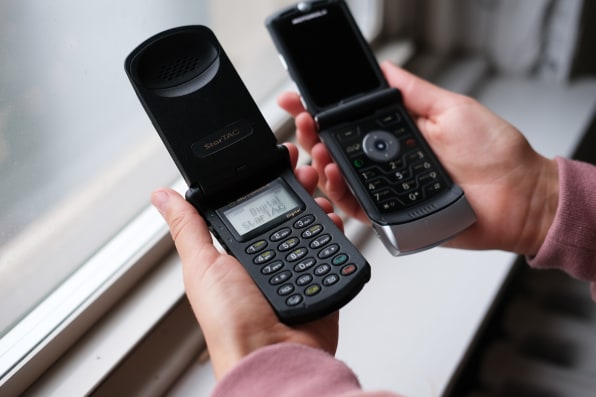
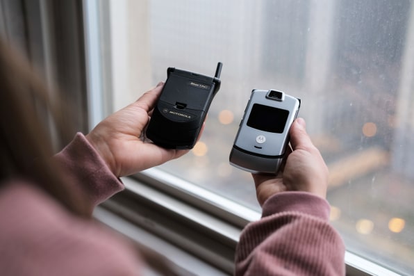
The year was 2003, and Motorola was planning a successor to its popular StarTAC phone, first released in 1996. Holding it in my hands at Motorola’s Chicago headquarters, the minimal, charcoal black flip phone is impossibly light and impressively thin—even by today’s standards. But this phone was seven years old and had ceased to woo the market. The screen was small. The buttons were miniscule. It was built for calling in a world leaning toward multimedia.
It was roughly a moonshot.”
Motorola knew the StarTAC needed a modern makeover to compete, but it didn’t want to be yet another thick phone on the shelf. The brief of the new phone was built around a single, groundbreaking premise. “A wonderful part of Motorola history and culture is it’s very engineering focused,” says Pierce, with what I sense as at least a slight sense of sarcasm in his voice. “And one of the things at the time that was super clear—I would say one of the clearest things of any product we developed—it was a very objective statement: ’10mm.’ To be clear, it was almost that simple. Ten millimeters.”
Motorola wanted a phone that was 10mm thin. Competitors were pushing 20mm at the time, and Motorola engineers and executives planned to half this number to make a splash.
“It was roughly a moonshot,” says Pierce. But the declaration was the most unifying message Pierce ever recalls hearing in his decades at the company. “What worked so well, is every team member—and we don’t always get the same alignment today—but you’d ask anyone on the team, what’s the objective? And they could tell you exactly the objective. Word for word.”
Ten millimeters. Or what became casually referenced as “razor thin.”
Building the first cell phone of a new era
The team’s first thought was to build something like a StarTAC 2.
The designers mocked up a reference model that’s been lost to time, but Pierce describes a device with flared knuckles and a sloped chin. People were excited to see the 10mm model internally—and yet, it felt wrong. “Within [the design team], what we talked about is [that] we didn’t want to make a retro device,” recalls Pierce. “We didn’t want to make a new [version] years later.”
Motorola wanted to build the future. The company knew from global ethnographic research that, while America was lagging, people were using phones differently. They were texting more and more. So the keyboard should be big. Real big. The screen had to be big, too, for early internet browsing and some of the first downloadable games. A second, external screen should let you check the time and preview calls before answering them. And it had to fit into your pocket. “No compromises,” became a secondary mantra. This thing had to be thin, but it also had to be extraordinarily usable. Such stringent design requirements meant completely reassessing the cell phone’s form factor.
There were people saying, ‘Let’s kill it!’”
When it was released, the Razr seemed almost freakishly wide. Even though it was no wider than a modern smartphone of today, subjects in Motorola’s focus groups reported not wanting a phone with such an expansive X dimension. “There was a lot of concern before we launched it, that this product was just too wide,” says Pierce. “There were people saying, ‘Let’s kill it!'”
But the phone had to be that wide, if it was to hit the 10mm mark and still fit all the necessary circuitry inside. The width also made it possible to add a larger keyboard to the device.
Elisa Vargas, the global UX design director at Motorola who ran many early studies and pioneered the Razr’s UI, was confident users would want that bigger keyboard because she recognized a shift in user behavior on a global scale: In many countries, people were T9 texting without even looking down at their thumbs. “We did a couple [studies] in established markets and one emerging markets, and you were seeing similar behaviors,” says Vargas. “We had a good idea about what people were doing with messaging . . . before that was popular in the U.S. I remember trying to recruit people in the U.S. [for a study], and nobody was doing text messaging!”
She was certain it wasn’t a question of culture. Americans would soon follow, and the Razr would be ready for them.
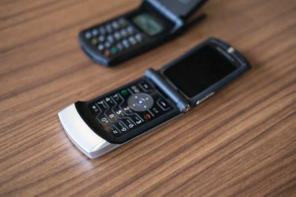
Originally, Motorola’s engineering team proposed a keyboard with a plastic cover that felt a lot like the one you’d find on a microwave. It was slender enough, but also felt weird—and cheap—to the touch. During a brainstorming session between engineering and design, Pierce came up with a better idea. “Aging myself, I used to do a lot of mechanical drafting with pencils. We had a thing called an eraser shield. It was a thin piece of metal that had shapes carved into it. You’d put it on a drawing to erase part of a line,” he says. “We pulled that out and said, this gives us the same goals this microwave panel has. It’s very thin. But it gives us a metal finish, which gives a much higher perceived quality.”
Was it odd to Pierce that the Razr’s keyboard was inspired by a drafting tool? “We needed something extremely thin! It had to be stiff so it wouldn’t be rippled, and it needed to flex,” Pierce says with a laugh. “That’s what came to mind!”
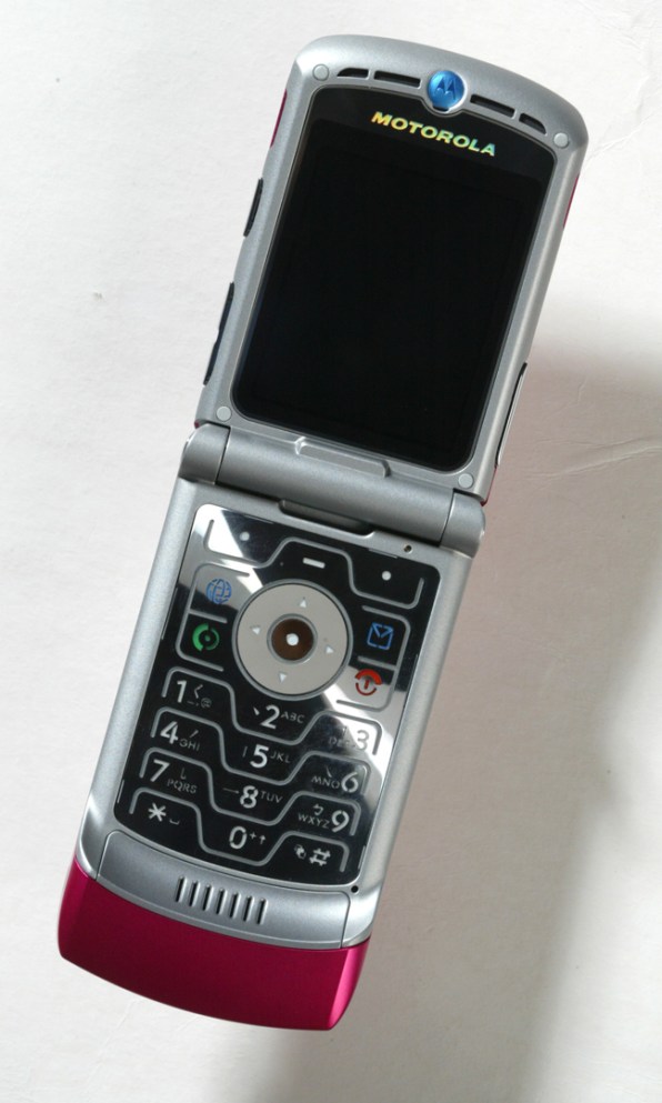
In production, the Razr keyboard was laser etched from a single piece of metal. It was backlit by an unusual, blue electroluminescent display that was designed to be noticed by onlookers from 10 feet away. The engineering team wasn’t sold on the backlighting tech, so lead designer Chris Arnholt went to Radio Shack one weekend and constructed a little blue light box out of LEDs. It wasn’t small enough for the phone, but the rough demo allowed Motorola’s head of PR, Jerry Frost, to see the Tron-inspired lines for himself. “He said, ‘This is it, this is going in the product,”” recalls Pierce. “That became a challenge . . . but we figured it out.”
The keyboard had one final touch I’d forgotten about until I picked up one of the two dozen Razr models Motorola pulled from the archives as I reported this story. The finish ripples like a stone thrown into a pond, creating an optical spinning effect. Rippling metal was a leitmotif of Y2K era design (see: the Nokia 3300 or the TLC Waterfalls video). But the nickel finish was actually inspired by the metal backplate work common in the watch industry. The way the keyboard catches the light is still captivating—you open the phone, and it bursts bits of J.J. Abrams lens flare right into your eyes.
“One of the key things from design perspective was an idea of surprise,” says Pierce. “We liked this idea the user would have no expectations, never seen a product like this . . . and as soon as you open it up, you get this rich metal finish. And look how big the keyboard is!”
For the Razr’s exterior, the team opted for aluminum paneling and a hardened, 0.7mm glass cover for an external display. These were premium materials that made the Razr feel more like jewelry than technology. But they were also premium by necessity: To hit that 10mm goal, plastic components simply couldn’t provide the necessary rigidity at the right thickness. (Glass and aluminum have a similar stiffness at the same thickness, unlike plastic.)
The team debated the decision to put glass on the outside of the phone, and even created a secondary mockup that had a plastic display cover instead. That pushed the phone’s thickness to 11mm. When the two prototypes were handed to decision makers, the choice was simple: 10mm or bust.
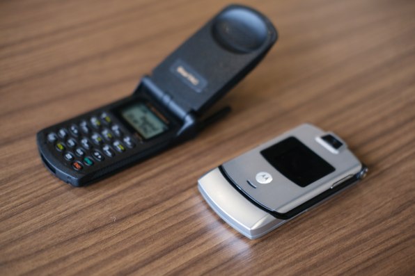
“We talked about it at the time, it was like a Zippo lighter kind of thing,” says Pierce. “You recognize the sound.”
“It’s all those little details that made people emotionally connect to that device,” adds Vargas.
It was like a Zippo lighter kind of thing. You recognize the sound.”
The final clash between design and engineering was over the phone’s “chin.” The chin, in retrospect, is the most iconic piece of the Razr. But as Pierce says, he wasn’t initially a fan.
“The problem with the chin is, once you open it up, the chin still tells you the full dimension of the product when it’s closed,” he explains. “From a design perspective, I’m like, when I have it open, I want this incredibly thin object. I don’t give away what it looks like.”
The design team mocked up Razr models without a chin, but it ultimately proved to be a functional necessity. Just like the new OLED Razr, the chin was where the phone’s antennas would have to go to optimize performance. “We grew to love it because it’s one of the things that makes it iconic, and was a breakthrough for performance,” says Pierce. “It allowed us to get the antenna further from the person’s head, which allowed us to ramp the power up, and get a better signal. [These were] things that were really part of Motorola’s history: ‘I can take a call where other people can’t.'”
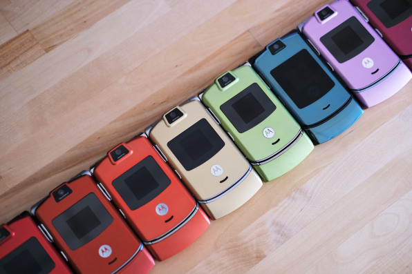
The phone celebrities wanted—but anyone could buy
The Razr checks all the boxes of iconic industrial design: innovations of necessity. Quirky aesthetics. Premium materials. A unique point of view. But the silver Razr was only the beginning.
After the Razr launched, some clever marketing by a Los Angeles advertising group scored the device a spot in the 2004 Oscar gift baskets of every Hollywood A-lister. The move helped the Razr become the first gadget that transcended technology to become a status symbol.
Steve Jobs himself called it ‘an iPod Shuffle right on your phone.’”
“Once it became popular, everyone wanted their own custom [Razr],” recounts Mike Jahnke, principal industrial design engineer who handled a lot of the customization in the Libertyville office. The team would tear apart Razrs, prep parts like the battery door with an aluminum primer, then paint, silkscreen, and laser-etch custom designs. Some were one-off designs for influencers. Others were color studies to be mass-manufactured on the assembly line. Jahnke produced hundreds of custom Razr designs over the years, including a faux wood Razr and one covered in brand ambassador David Beckham’s tattoos.
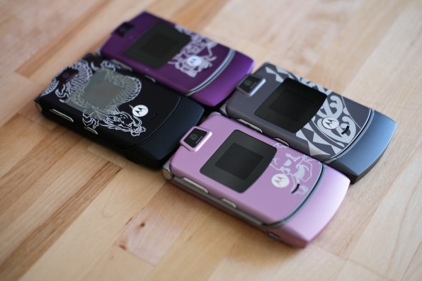
One Thursday before Wimbledon in 2005, Jahnke received a call asking him to create a pink Razr for an up-and-coming tennis player named Maria Sharapova. Jahnke received her favorite pink swatches, sprayed up a phone, and sent it overseas. She wouldn’t win that year, but she would make a call on the phone after the tournament and cause a small media sensation. Motorola soon put a Sharapova-pink Razr into mass production.
“I have a picture of Bono with the two Project Red phones I made, and he’s holding them like sunglasses,” Jahnke laughs. “There’s Bono! The lead singer of the biggest band in the world using something I had a very little part of.”
The Razr would go on to sell 130 million units over the next few years. It was such a hit that in 2006, two years before Apple released the iPhone, Cupertino partnered with Motorola on a media-focused cell phone called the ROKR. Steve Jobs himself called it “an iPod Shuffle right on your phone.” Unfortunately, the partnership wasn’t enough to build the next breakthrough phone. Motorola management opted to run the Razr brand into the ground rather than investing in the kinds of innovations that enabled the landmark design in the first place. To grab marketshare, the company plunged Razr prices so low that profits dropped to as low as $5 per unit.
But Razr changed the world all the same, creating a model for the covetable, luxurious, personal communication devices to come. Before we had the iPhone—the premium smartphone for everyone, rendered in aluminum and glass—we had the Razr, a premium flip phone for everyone, rendered in aluminum and glass. The Razr is a snapshot of a turning point for the technology industry. Consumer electronics were assuming a new role leading culture, in a world where every celebrity wanted to own an object that cost hundreds of dollars rather than millions, simply because it was that cool.
“There was an internal debate when we were developing it, whether this was really about tech or this was about fashion,” says Pierce. “Clearly, at the end of the day, it was about fashion.”
Read the rest of this series, on the design of Y2K years, here.
"phone" - Google News
December 09, 2019 at 06:00PM
https://ift.tt/2Pm6GrO
The secret history of the Motorola Razr, the first great phone of the millennium - Fast Company
"phone" - Google News
https://ift.tt/2LvVM1w
Shoes Man Tutorial
Pos News Update
Meme Update
Korean Entertainment News
Japan News Update
Bagikan Berita Ini


0 Response to "The secret history of the Motorola Razr, the first great phone of the millennium - Fast Company"
Post a Comment